DataPlotly plugin real life use cases
DataPlotly plugin allows to use real data to study the numerical distribution of some variables.
COVID-19
Covid-19 pandemic is unfortunately well known in the whole world. Thanks to ourworldindata.org and the John Hopkins University we have real data to study the pandemic spreading.
Working in QGIS
After loading the data in QGIS we have 2 layers to work with:
-
a flat table named
covid_tablethat contains time data for each country: we have repetitive rows for each country depending on the data: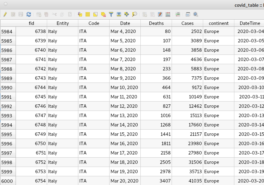
-
a spatial polygon layer that represents the whole world with the columns of
Deaths,Casesand theDateTimeof the last available day (a python script is downloading and shaping the data automatically every day):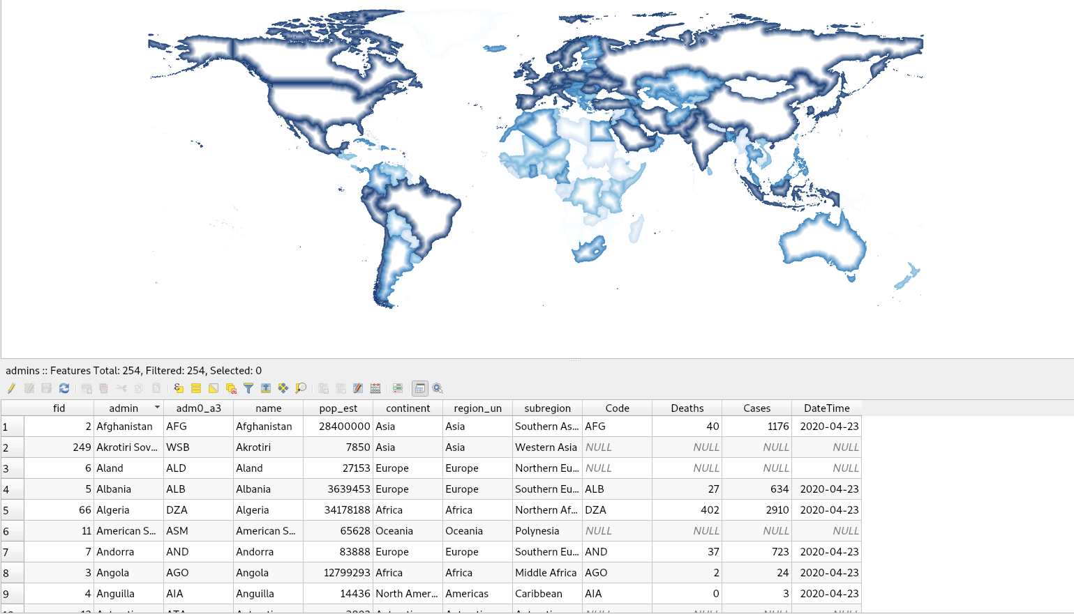
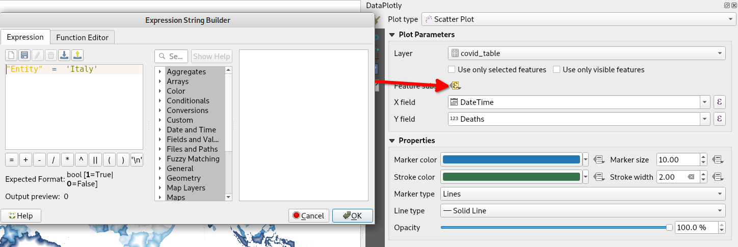
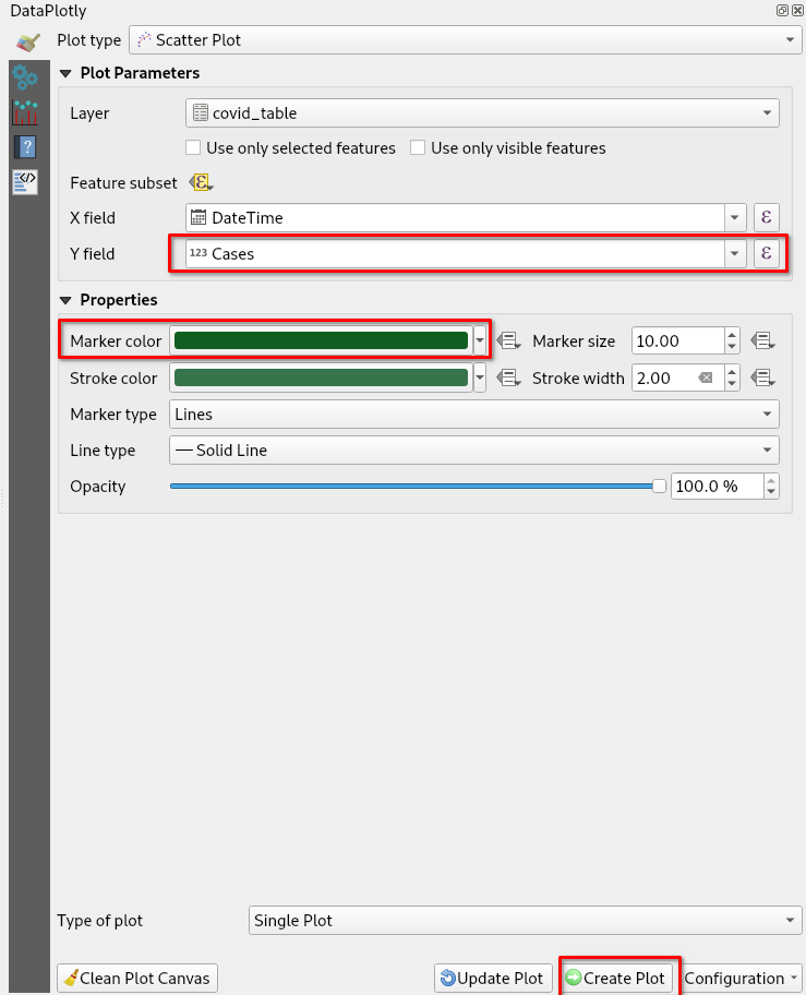
We can use the first non spatial table to filter only one single country, e.g.
Italy with the Feature Subset button and adding the filter as
"Entity" = 'Italy':
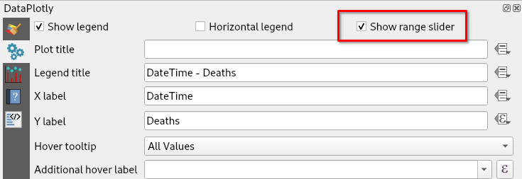
We can then check the Show Range Slider in the Advanced Configuration tab
to add a nice time range slider to the bottom of the plot:
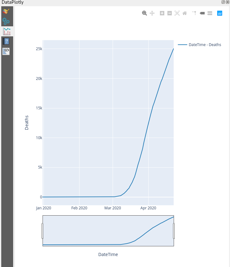
Finally let's create the first plot of the filtered values of Italy using
DateTime as X values and Deaths as Y values. We don't want single points for
each day, to choose Lines as the Marker Type:
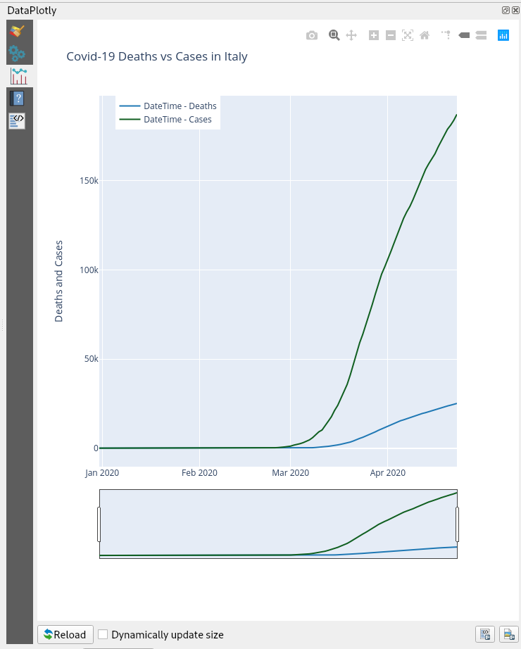
Now let's overlap on the same plot also the Cases trend. Just repeat the
previous step changing the Y value to Cases and changing also the color.
Finally click on Create Plot:
You will end up with two overlapped plots:
Download the project from our server.