DataPlotly crowdfunding campaign
Link of the Crowdfunding campaign
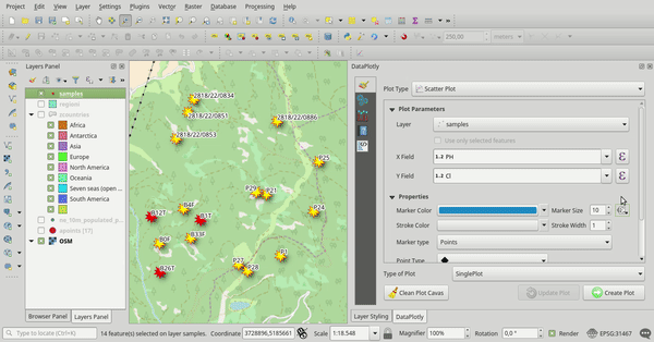
The QGIS DataPlotly plugin (developed by Faunalia) allows for creation of D3-like interactive plots directly within QGIS, using the feature-rich and mature Plotly library. Although it’s been designed with simplicity in mind, the plugin exposes a powerful interface for creation of custom plots with a wide variety of plot templates and configuration options. Additionally, for compatible plots, users can click points within the generated chart (e.g. data points in a scatter plot) to automatically select the corresponding features in the map canvas.
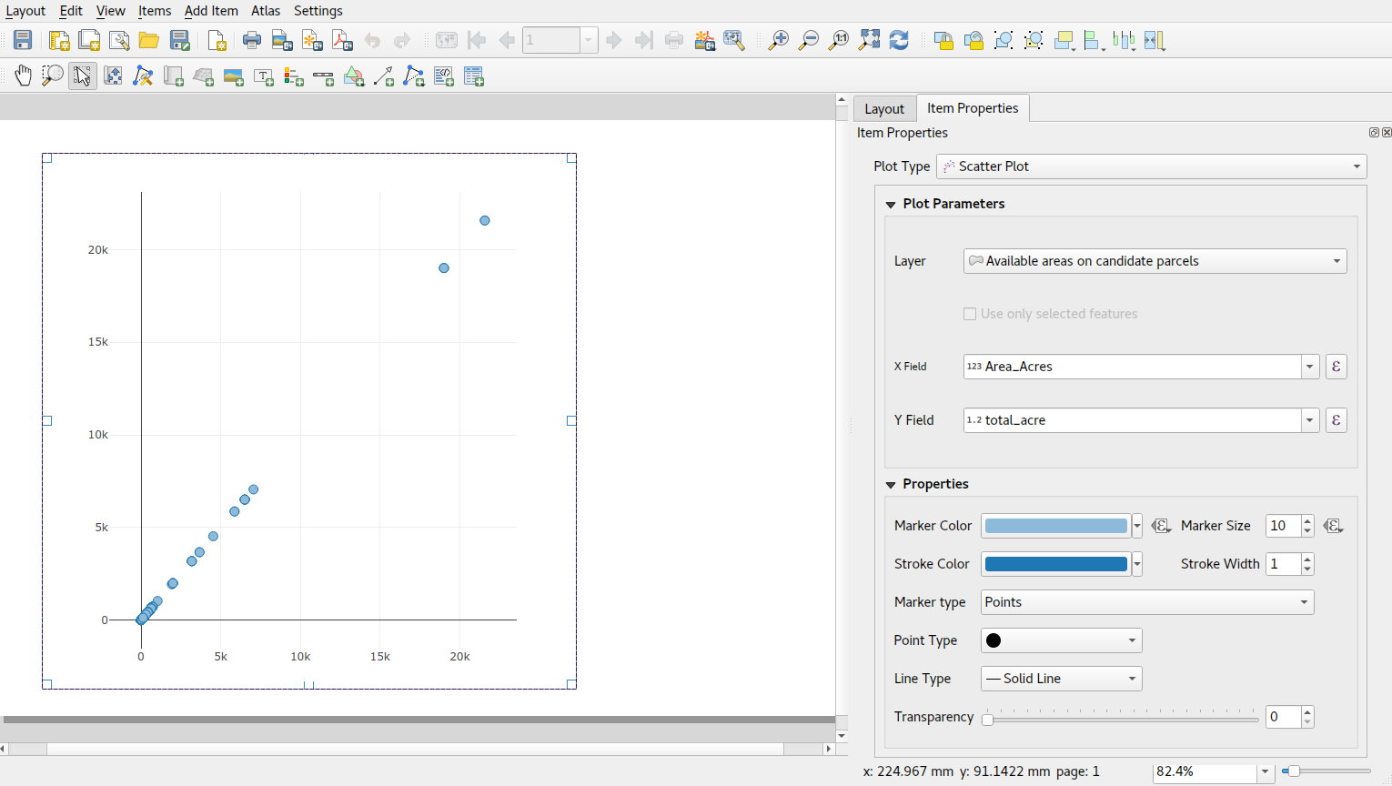
Currently, while the Data Plotly plugin is great for interactive “data exploration”, it is only possible to export the generated plots as either HTML or PNG files. This makes it very difficult to utilise the charts in other areas of QGIS, in particular the powerful QGIS print layout designer. In order to address this shortcoming, North Road Faunalia are proud to announce a joint campaign to extend the Data Plotly plugin functionality, allowing creation of feature-rich charts and plots directly within QGIS’ Print Layout Designer.
Progress
8600/8600€
SUCCESS!
About the campaign
If this crowd funding campaign is successful, we will add the following functionality within the Data Plotly plugin (and implement any required changes within QGIS itself required for this work!):
-
Charts in QGIS print layouts This is the big one! If the campaign is successful, we will add the ability to insert Data Plotly charts directly inside QGIS print layouts (and print atlases!). This would address a large limitation in QGIS’ print layout functionality, and we think Data Plotly’s rich functionality and configuration options would be a perfect fit for print layouts. Specifically, we will:
-
Add a new layout item type for “Charts”
-
Expose the relevant settings from the Data Plotly chart dock when a chart item is selected in the print designer. This means that ALL chart templates (including future ones!) will be available for use in your QGIS print layouts.
-
Charts will be exported as “vector” graphics (when layouts are exported to a compatible format), ensuring that they retain their original quality regardless of the scale or zoom level at which the export is viewed/printed, and allowing them to be edited in other post-production illustration software.
-
Ensure that chart “data-defined” settings and expressions will be correctly updated and become layout and atlas aware. This will allow charts to dynamically alter their appearance based on factors such as the current atlas feature’s geometry and attributes, and other factors such as the current page size or shape.
-
Geometry intersection based chart filtering An often-requested feature for Data Plotly is the ability to dynamically update charts based on features visible only within a certain extent (such as the current map canvas extent). We’ll be addressing this request as part of the campaign, and expose this as a “filter to canvas extent” option (when used in the main Data Plotly dock), and “filter to current atlas feature”/“filter to visible features” option (when used within a QGIS atlas or print layout)
-
Saving/restoring plot configuration Currently, the plugin has no method of saving the configuration of created plots. This is a significant shortcoming, as it requires users to recreate plots from scratch with every new QGIS session. If the campaign is successful, we will add support for saving plot configuration to a file and for restoring configuration from files. This option means that users would also have a method of “sharing” their configurations with other QGIS/Data Plotly users. (This functionality is also required to allow the plot configuration to be saved inside print layouts and print layout templates).
-
Non-interactive plots The DataPlotly plugin currently only supports creation of “interactive” plots, which allow users to zoom, pan, and query the plots. While this is a fantastic feature inside the Data Plotly dock, the plots designed for use in print layouts need to be “static” plots, without any of this interactive functionality. Most importantly, this would include removal of the toolbar shown at the top of Data Plotly charts when print layouts and QGIS atlases are exported!
-
-
Code restructure and unit tests The current Data Plotly code was designed around use within the interactive plot dock area. In order to facilitate the desired features, it is necessary to extensively “refactor” the Data Plotly code to completely separate the plot generation code from the GUI component of the plugin. This redesign will be completed as part of the campaign deliverables, and corresponding “unit tests” ensuring stable plugin operation will be added during the refactoring.
Hall of fame
Current contributors to this work include:
- Federico Gianoli
- Papercraft Mountains
- Liam McCrae
- Henry Walshaw
- Raúl Sangonzalo
- Ferdinando Urbano
- pitsch-ing.ch
- Carbon-X
- Gabriel Diosan
- Rene Giovanni Borella
- Enrico Bertonati
- Guido Ingwer
- David Addy
- Gerd Jünger
- Andreas Neumann
- Stefano Campus
- Michael Jabot
- Korto
- Enrico Ferreguti
- Carlo A. Nicolini
- Salvatore Fiandaca
- Alberto Grava
- Hans van der Kwast
- Ben Hur Pintor
- Silvio Grosso
- Nobusuke Iwasaki
- Alasdair Rae
- Manori Senanayake
- Canton de Neuchâtel
- Matthias Daues
- Alteri Seculo
- SunGIS Ltd.
- Stu Smith
- Keolis Rennes
- Aiden Price
- Giacomo Ponticelli
- Diane Fritz
- Gemio Bissolati
- Claire Birnie
- Nicolas Roelandt
- Rocco Pispico
- Gabriel Bengtsson
- Birds Eye View
- Barend Köbben
- Roberto Marzocchi (GTER)
- Yoichi Kayama
- Alessandro Sarretta
- Luca Angeli
How it works
Crowd funding operates by multiple organisations (or individuals) each pledging to contribute part of the campaign’s funding goals. In order to make the proposed changes to the Data Plotly plugin, we require 8,600€ to make these changes a reality. You can contribute part (or all) of these funds. If the funding goal is NOT reached, then no contributions are payable and the features will not be added to Data Plotly.
If you’d like to see this feature extending the power of QGIS’ charting and print layouts, then your contributions are vital! Pledge, or publicize, this campaign to help it reach the funding goal before the April 30 deadline!
How to financially contribute to the campaign
We understand that it can be difficult for organizations to approve contributing to a crowd-funding effort, so we’re trying to make this process as painless as possible. Yet at the same time, we want to make the campaign accessible for end users to contribute too! Accordingly, we’re running this campaign under a two-option model:
Option 1: Pledging a contribution
- To contribute to the campaign, just email crowdfunding@north-road.com and let us know your details and how much you will be contributing to the goal. Due to the administrative burden of processing payments, the minimum pledge we will accept is 100€ (or equivalent).
- We will contact you to discuss payment options – but NO payment is required in advance!
- If (and ONLY if!) the campaign is successful we will invoice you directly for your pledged amount. Payment in full will be required within 14 days of the campaign’s completion. (Please contact us to discuss if you need different payment terms).
- When we have received all pledged funds we will commence the work detailed above, and provide regular updates as we go.
We believe this system will give organisations confidence that contributing to the campaign carries no risk and is compatible with their organisation’s accounting procedures. If however you have concerns or would like to contribute in another way, just contact us to discuss further!
Option 2: Donating to the campaign
If you’d rather skip the hassle of a pledge, or would like to contribute an amount less 100€, then we also accept direct donations to the campaign! A donation counts towards reaching the campaign goal in exactly the same way as a pledge, BUT a donation payment is processed immediately and is payable regardless of whether the campaign reaches its goal. If the campaign is NOT successful, all donations received will be used to fund as much of the described changes as possible.
Link of the Crowdfunding campaign
FAQ
-
What happens if contributions exceed the campaign goal? If contributions are in excess of the stated goal, we will reinvest the excess back into Data Plotly by using it to fund some “stretch goals”, specifically:
- Adding more “data defined” properties to Data Plotly charts, allowing the chart components to be styled based on feature (and atlas!) attributes
- Allow creation of charts which only show child features related to the current atlas feature (wherever appropriate layer relations exist in a project)
About us
This work will be undertaken by QGIS core contributor, Nyall Dawson, and Faunalia plugin developer Matteo Ghetta.
At North Road and Faunalia we invest back into the open-source geospatial community. We do large amounts of volunteer fixes and feature additions across the open source geospatial stack, so by investing in us you also help support us improve the open source GIS stack.
We use the software we develop daily, so we take pride in developing stable, polished code with extensive regression testing and refined workflows. We offer long-term support for the code we create, providing proactive fixes and improvements even after a project is complete. Our development record demonstrates the confidence you can place in us for timely delivery of this crowd funding campaign’s product.
Please contact us for any further details on this project or for contributing to this campaign.